http://www.zerohedge.com/news/2012-10-20/presenting-all-us-debt-thats-fit-monetize
 Submitted by Tyler Durden on 10/20/2012 18:41 -0400

and.....
http://advisorperspectives.com/dshort/guest/Jeff-Miller-Week-Ahead-121021.php
Last Week's Data


and......
http://soberlook.com/2012/10/treasuries-now-have-worst-riskreturn.html?utm_source=BP_recent
In addition to the ridiculously low current coupon these days, the duration of the 10y bond is now considerably higher (precisely because of the low coupon), making the bond more vulnerable to rate shocks. That's why the 100 bp rate increase (dark blue) causes a much higher principal loss now than it did at any time in the past 40 years.
Presenting All The US Debt That's Fit To Monetize
Over the past 4 years the Fed's strategy in response to the Second Great Depression has been a simple one: purchase record (and now open-ended) amounts of fixed income product (offset by releasing record amounts of reserves in the banking universe which in turn has converted every bank into a TBTF and Fed-backstopped hedge fund, as the concurrently shrinking Net Interest Margin no longer leads to the required ROA from legacy bank lending) to stabilize the bond market, and to crush yields in hopes of forcing every uninvested dollar to scramble for equities, primarily of the dividend paying kind now that dividend income is the only "fixed income" available.
So far the strategy has failed for the simple reason that the smart money instead of being "herded", has far more simply decided to just front-run the Fed thus generating risk-free returns, while the "dumb money", tired of the HFT and Fed-manipulated, and utterly broken casino market, has simply allocated residual capital either into deposits (M2 just hit a new all time record of $10.2 trillion) or into "return of capital" products such as taxable and non-taxable bonds. Alas none of the above means that the Fed will ever stop from the "strategy" it undertook nearly 4 years ago to the day with QE1 (as any change to a "strategy" of releasing up to $85 billion in flow per month will be immediately perceived as implicit tightening and crash the stock market). Instead, it will continue doing more of the same until the bitter end. But how much more is there? To answer this question, below we present the entire universe of marketable US debt, in one simple chart showing the average yield by product type on the Y-axis, and the total debt notional on the X.

The Fed, with the recent advent of QEternity, aka the incorrectly named 'QE 3', is already engaged in the monetization of virtually everything to the right of Municipal debt (under the blue arrow in chart below). The reason why the Fed needs to continue buying up Treasurys in the 10Y+ interval is simple - in doing so it is funding the long-end of US deficit spending, aka everything that has a greater than zero duration in the age of ZIRP. However, that amount is merely enough to keep the status quo as is, in other words to keep the deficit government funded. Remember that the Fed's ultimate goal is to inflate the debt stock of both the US and the world. Which means that not even QEternity will be enough. It also means that very soon the Fed will be forced to shift its monetization appetite further to the left of the X-axis, and increasing buy up more and more higher yielding fixed income product, in a rerun of Japan, which the US has now become. Recall that the BOJ is also openly monetizing Corporate debt, as well as various equity-linked products.
Said otherwise, the "smart money" is now loading up on those debt products, IG and HY debt, munis and non-agency MBS, which the Fed will sooner or later become the buyer of first, last and only resort. And just like Bill Gross was buying up MBS on record margin in February (as we showed) in advance of QE3, so now everyone else is once again merely preparing for the inevitable next step, as the Fed proceeds to monopolize the entire marketable debt universe.
Sadly for the Fed this also means that any incremental free money will simply continue to chase more fixed income product before the Fed starts buying it (thus providing an easy bid to sell into), instead of buying up already ridiculously overpriced equities (where record profit margins are about to slam into the immovable walls of soaring input and commodity costs crushing the "cheap" P/E illusion), which in turn will force Bernanke to one day in the near future, go full Japanese retard, and announce the Fed will as a matter of policy, as opposed to simply via the PPT and Citadel in times of desperation, commence buying equities. But that's a story for another day.
and.....
http://advisorperspectives.com/dshort/guest/Jeff-Miller-Week-Ahead-121021.php
Weighing the Week Ahead:
An Early Verdict on Q3 Earnings?
An Early Verdict on Q3 Earnings?
The early returns are in!
The reaction to earnings turned negative, and it is easy to spot the turning point. Google [pending Larry quote] had an accidental early release of their earnings miss. The goof was the source of non-stop media coverage, and inspired a new twitter participant, @pendinglarry. My favorite tweets were these, but check them out for yourself:
-First thing I said after SEC filing went out: "Oh, Schmidt!"-To be fair, we released our earnings yesterday afternoon on Google Plus.-(and especially) Thought that Groupon deal for SEC document filing was too good to be true. You really do get what you pay for.
As I predicted last week, the market action is all about expectations and interpretation. The earnings results have actually beaten expectations (given the lower bar) but the revenue beat rate and outlook has been disappointing.
Downtown Josh Brown accurately reports the current verdict:
How's earnings season going? Only 42.3% of S&P 500 reported companies beat Q3 revenue expectations and 57.7% have missed. 64.9% have beat EPS estimates. Sucks.
The early conclusion is that earnings have been maintained only because of unsustainable cost-cutting. Some are drawing broad conclusions from a few reports, with a Barron's cover announcing the death of the PC.
I'll offer my own take in the conclusion, but first let us do our regular review of last week's news.
Background on "Weighing the Week Ahead"
There are many good lists of upcoming events. One source I especially like is the weekly post from the WSJ's Market Beat blog. There is a nice combination of data, speeches, and earnings reports.
In contrast, I highlight a smaller group of events. My theme is an expert guess about what we will be watching on TV and reading in the mainstream media. It is a focus on what I think is important for my trading and client portfolios.
This is unlike my other articles at "A Dash" where I develop a focused, logical argument with supporting data on a single theme. Here I am simply sharing my conclusions. Sometimes these are topics that I have already written about, and others are on my agenda. I am putting the news in context.
Readers often disagree with my conclusions. Do not be bashful. Join in and comment about what we should expect in the days ahead. This weekly piece emphasizes my opinions about what is really important and how to put the news in context. I have had great success with my approach, but feel free to disagree. That is what makes a market!
Last Week's Data
Each week I break down events into good and bad. Often there is "ugly" and on rare occasion something really good. My working definition of "good" has two components:
- The news is market-friendly. Our personal policy preferences are not relevant for this test. And especially -- no politics.
- It is better than expectations.
The Good
The economic news last week was mostly positive, including these highlights.
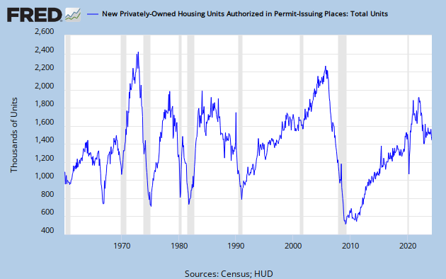
- Housing is stronger. I want to emphasize building permits, a leading indicator. It is costly to get a building permit, so it involves a real commitment. Steven Hansen has a nice analysis of this report, showing the data from various perspectives. This is the chart that I think is most helpful:
- Spain averted a ratings downgrade although the threat remains (via the FT). In fact, the general story from Europe seemed better, and key interest rates moved lower.
- Retail sales were much stronger -- not consistent with the onset of a recession (RecessionAlert).
- Leading Indicators from the Conference Board spiked higher -- but last month was revised lower. It is a small net positive, but "flatlining" in recent months as noted by Doug Short.

The Bad
The actual data last week was pretty good, but the stock result was bad. This happens, and it can be meaningful. Let us take a closer look.
- Superficial analysis, looking backward with too little data. The humorous example of the week comes from Chuck Todd, who jokingly notes the importance of the Florida State/Miami football game. Since 1988, this swing state has been won by Democrats whenever Florida State wins, and by Republicans whenever Miami wins. Florida State is a big pre-game favorite, but the outcome is in doubt at the time I am writing this. Does anyone really think this is relevant? Many of the current prediction methods (both for elections and for stocks) use a similar approach: fitting the hypothesis to old data -- not splitting the data into segments, and no "out of sample" test data. It is pretty easy to perfectly "predict" the last eight elections or recessions if you take this approach. (See more humorous examples via Barry Ritholtz).
- Chinese economic growth is worse than you think. This week's data may have seemed positive on first blush, but Kate Mackenzie takes a deeper look. The problem is that China uses year-over-year reporting rather than a quarterly report with seasonal adjustments. It is quite possible that China's GDP growth had a "six handle" in Q2, although there might now be a rebound. This story is well worth reading -- twice! (even more here).
- Existing home sales missed the forecast and the market seemed to move lower on the news. We'll score it as "bad." Calculated Risk thought it was a "solid report" because of reduced inventories and overall sales in a normal range.
- Initial jobless claims spiked higher, offsetting last week's surprise move lower. Both weeks are part of the period included in this month's payroll employment report. The overall level is still not good, but also not at recession levels.
The Ugly
There was nothing as ugly this week as what we experienced 25 years ago. I knew there would be many providing a look back. The Crash of '87 (which now seems so long ago) had an important effect on the business, the rules, and investors. I offered my personal experiences from the options business in this article. When looking back, it is important to find history that has implications for current decisions. With this criterion in mind, here are some of the best Crash Retrospectives (and maybe also some good stories):
- Josh Brown puts history in his own unique perspective. The best feature of Josh's blog is the unvarying devotion to the individual investor.
- Scott Rothbort (my friend and colleague at Wall Street All-Stars) does a really great job of putting the Crash in perspective, citing several other crises. Anyone would benefit from Scott's daily take on the markets. I certainly do. (I understand that everyone want free information. Sometimes a small payment is worth the investment. The dynamics and chemistry at this site make it both interesting and informative. You will definitely get a variety of viewpoints and some great trading ideas).
- Barry Ritholtz has a number of great links to 1987 stories. I especially enjoyed Art Cashinand Louis Rukeyser's show from that week.
The Indicator Snapshot
It is important to keep the current news in perspective. My weekly snapshot includes the most important summary indicators:
- The St. Louis Financial Stress Index.
- The key measures from our "Felix" ETF model.
- An updated analysis of recession probability.
The SLFSI reports with a one-week lag. This means that the reported values do not include last week's market action. The SLFSI has moved a lot lower, and is now out of the trigger range of my pre-determined risk alarm. This is an excellent tool for managing risk objectively, and it has suggested the need for more caution. Before implementing this indicator our team did extensive research, discovering a "warning range" that deserves respect. We identified a reading of 1.1 or higher as a place to consider reducing positions.
The SLFSI is not a market-timing tool, since it does not attempt to predict how people will interpret events. It uses data, mostly from credit markets, to reach an objective risk assessment. The biggest profits come from going all-in when risk is high on this indicator, but so do the biggest losses.
The C-Score is a weekly interpretation of the best recession indicator I found, Bob Dieli's "aggregate spread."
Bob and I recently did some videos explaining the recession history. I am working on a post that will show how to use this method (trying for this week). As I have written for many months, there is no imminent recession concern. I recently showed the significance of by explaining the relationship to the business cycle.
The ECRI recession call is now over a year old. Many have forgotten that at the time of the original prediction, the ECRI claimed that the recession was already underway by September of 2011. See New Deal Democrat's carefully documented discussion, including the original video, at the Bonddad Blog.
RecessionAlert offers a free sample report. Anyone following them over the last year would have had useful and profitable guidance on the economy.
Doug Short's most recent update notes the discrepancy between the ECRI public data and the continued recession forecast (excellent chart reproduced below, but please read the full story). Doug has been an open-minded monitor of the various arguments, so his analysis deserves respect. The most recent news from the ECRI states that they are "Assessing the Current Optimism." This is apparently available only to paid subscribers, the ones who had early access to the 2011 forecast.
The public will await this report with some interest. Meanwhile, their WLI has turned higher, which everyone following their data sees as good news. Maybe it is time for them to "predict" that the recession will end within the next few months!
Readers might also want to review my new Recession Resource Page, which explains many of the concepts people get wrong.
Our "Felix" model is the basis for our "official" vote in the weekly Ticker Sense Blogger Sentiment Poll. We have a long public record for these positions. This week we continued our neutral forecast. These are one-month forecasts for the poll, but Felix has a three-week horizon. Felix's ratings have continued to drift lower. The penalty box percentage measures our confidence in the forecast. That indicator is moving higher, indicating little confidence in the current neutral rating. It has been a close call over the last few weeks, as the ratings moved out of bullish territory.
[For more on the penalty box see this article. For more on the system ratings, you can write to etf at newarc dot com for our free report package or to be added to the (free) weekly ETF email list. You can also write personally to me with questions or comments, and I'll do my best to answer.]
The Week Ahead
This week brings a little economic data.
The "A List" includes the following:
- The last Presidential debate (M). Still playing to undecided voters in swing states, and trying to do this via foreign policy positions.
- Initial jobless claims (Th). Continuing strong interest after the fluctuations of the last two weeks.
- Q3 GDP preliminary report (F). While this is subject to revision, the first official look at actual Q3 growth will be interesting.
The "B" List" includes these entries:
- FOMC decision. (W). This would normally be big news, but what more can they say?
- New home sales (W). Comparisons to existing sales will be interesting.
- Durable goods orders (Th). Interesting for GDP effects.
Also the revisions to the Michigan index.
Most important will be many more earnings reports from a wider variety of sectors.
Trading Time Frame
Felix has continued the neutral posture of the last few weeks. It has been a close call between neutral and bullish for several weeks, but it is turning more negative. Felix has done very well this year, becoming more aggressive in a timely fashion, near the start of the summer rally. Since we only require three buyable sectors, the trading accounts look for the "bull market somewhere" even when the overall picture is neutral. The ratings have moved lower again this week. We actually shifted to bonds (via TLT) for a profitable trade, and we are now completely out of the market for trading accounts.
Investor Time Frame
Each week I think about the market from the perspective of different participants. The right move often depends upon your time frame and risk tolerance. Individual investors too frequently try to imitate traders, guessing whether to be "all in" or "all out."
The traders (including Felix) are getting more cautious for a variety of reasons. Some are trying to lock in profits to earn their bonuses. Investors face a completely different problem.
Tom Armistead illustrates this effectively with an excellent analysis of a method for investing in high-quality, low-beta, dividend stocks. Even cautious investors can profit from this approach. Tom notes that you can augment the yield by selling calls on these stocks. This is very similar to what I have been recommending as an improvement or addition to a bond portfolio.
****
Final Thoughts on Earnings Season
In the last two weeks I have noted that we were entering the season of fear. There has been a change in tone, with little response to good news. Stocks had the worst week in months while the data were actually somewhat positive.
Thousands of companies will report earnings in the next few weeks. So far we have seen about 20% of the reports. When the overall earnings story is mixed, we can expect many to present a downbeat outlook. There is little reason to make bold predictions. Executives can be cautious, citing problems in Europe, China, and Washington.
I am also watching for evidence that businesses are cautious while waiting for a resolution to the "fiscal cliff."
The actual earnings "beat rate" will probably be close to historical norms, but the short-term outlook depends on psychology and trader sentiment. Just as it did last week, this can change swiftly. This is why agile traders can afford to be cautious, while investors should be seizing opportunities.
***
and......
http://soberlook.com/2012/10/treasuries-now-have-worst-riskreturn.html?utm_source=BP_recent
FRIDAY, OCTOBER 19, 2012
Treasuries now have the worst risk/return profile in decades
Below is an excellent chart from Goldman Asset Management. It shows the risk/return profile of holding the 10y treasury during different periods of time. "Principal" is the mark-to-market impact of the bond yield increasing by 100bp (1%). "Roll" is the impact of time passage. In one year the 10y bond becomes the 9y bond, and if the yield curve is positively sloping, the 9y bond should have a lower yield, offsetting slightly the 100bp yield increase. "Coupon" is just the income collected in one year, and "Total Return" is a combination of the three.
In addition to the ridiculously low current coupon these days, the duration of the 10y bond is now considerably higher (precisely because of the low coupon), making the bond more vulnerable to rate shocks. That's why the 100 bp rate increase (dark blue) causes a much higher principal loss now than it did at any time in the past 40 years.
GS: - In the 1980’s, the average yield and duration of the 10-Year Treasury was 10.6% and 6.1 years, respectively. When rates rose 100 bps, investors still made money. Today, the on-the-run 10-Year Treasury has a yield of 1.6% and a duration of 9.2 years, resulting in heightened rate sensitivity and significantly less coupon to offset principal losses during periods of higher rates.
 |
No comments:
Post a Comment