http://soberlook.com/2012/07/5yr-treasury-yield-hits-record-low.html
MONDAY, JULY 16, 2012
The 5yr treasury yield hits a record low
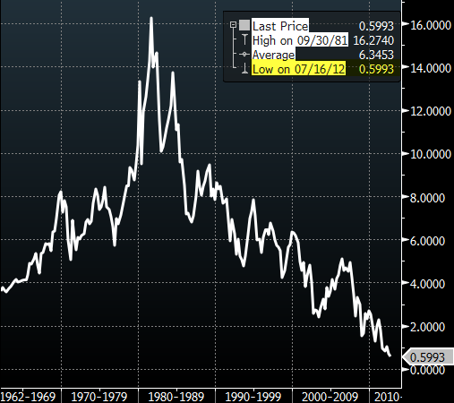
The recent compression in US treasury yields has been nothing short of extraordinary. Driven by the full realization that we are in a global slowdown, the 5-year hit a record low today of just under 0.6%, following a decline that has been ongoing for decades.
 |
| US 5yr treasury yield |
WSJ: - U.S. Treasury yields fell to the brink of new all-time lows [the 5-year is in fact at an all-time low today, but the WSJ reporter seems to only track the 10yr] as concerns about a U.S. economic slowdown spurred demand for financial safety, extending the market's rally this month.
The benchmark 10-year note yielded as little as 1.440% midday, a hair away from its 1.437% record low set on June 1 after a weak employment report. The yield on five-year notes sank as low as 0.577%, a new record for that maturity. Bond yields fall when prices rise.
A retail industry report early Monday showed sales falling for the third consecutive month in June, stoking fears about a snag in the U.S. recovery. Consumer spending, a crux of the U.S. economy, remains constrained by high unemployment and households' efforts to work off debt.
"Clearly things are slowing down, more so than most had expected," said Larry Milstein, head of government and agency trading at R.W. Pressprich & Co. "For a while, everyone was focused just on Europe. Now we're seeing the slowdown here and in China—major drivers of global growth."
and......
http://www.zerohedge.com/news/us-treasury-curve-1990-2012-its-full-3-d-glory-redux
US Treasury Curve 1990-2012 In Its Full 3-D Glory: Redux
Submitted by Tyler Durden on 07/16/2012 13:09 -0400
Just under two years ago, when we mocked then Morgan Stanley's analyst Jim Caron's call for a surge in long-dated yields on the back of an improvement in the economy (not something more realistic like the Fed losing all control of the TSY curve), we penned "Visualizing The Past Of The Treasury Yield Curve, And Deconstructing The Great Confusion Surrounding Its Future" in which we said that contrary to pervasive expectations of a bull steepener, the treasury curve would continue flattening more and more, until the whole thing would become one big pancake. Today, we have decided to revisit that post: in short - Jim Caron was fired by Morgan Stanley as head of rates following 3 consecutive years of bad calls starting in 2009 (only to be rehired in June as a Portfolio Manager... oops), while our view that sooner or later the 2s30s will be 0 bps is over one third complete.
To wit, from August 2010:
The chart below shows the UST yield curve over the past 20 years: as is more than obvious, every single point left of the 10 Year is at record tights. The only question on everyone's lips is where do we go from here. And that is where the confusion really hits.Of course, it is now obvious what the Fed wants to achieve, as it gets ever close to using the last available nuclear option: outright monetization of every single asset class. The graphic representation of what Bernanke would like more than anything to be the economic reality is presented on the chart below.We hope that when looking back in 2012 at this post we are proven wrong, as a completely flat yield curve coupled with an economy that is collapsing ever faster, is the surest way to an outright stock market supernova, that will take obliterate all asset levels in a bout of hyperdeflation (for leveraged items), followed by hyperinflation (for items purchasable by banks with discount window access).It is now 2012, and we can look back. We have not been proven wrong. The 2s30s (or 0s30s - it is all the same now that ZIRP+3 is Fed policy, soon to be +4, +5, etc leaving less and less places on the curve to frontrun) is not 0bps quite yet.... but it is well on its way, and is now 150 bps tighter than it was on August 15, 2010.Furthermore, our forecast from 2010 for a flat curve is still as follows: "a bout of hyperdeflation (for leveraged items), followed by hyperinflation (for items purchasable by banks with discount window access."And yes, our conclusion from back then still stands:The bottom line is now that the Fed is once again actively involved in controlling the curve, and thus risky assets, the result is utter confusion. If two of the biggest investment banks can not agree on something as simple as the shape of the yield curve, how is it that they or anyone else, can have an informed opinion on where assets that return more than 4% (in 30 years) will head in the future. Essentially, uninformed coin flipping is now the best paid occupation in the world.And courtesy of Konrad, here is a video animation of all of the above using Amibroker.


No comments:
Post a Comment